The Internet giant Google on Tuesday released a major refresh of its mobile Gmail app, which has now adopted the company’s Material Design guidelines as part of a larger effort to make G Suite look and act like a family of tightly integrated products.
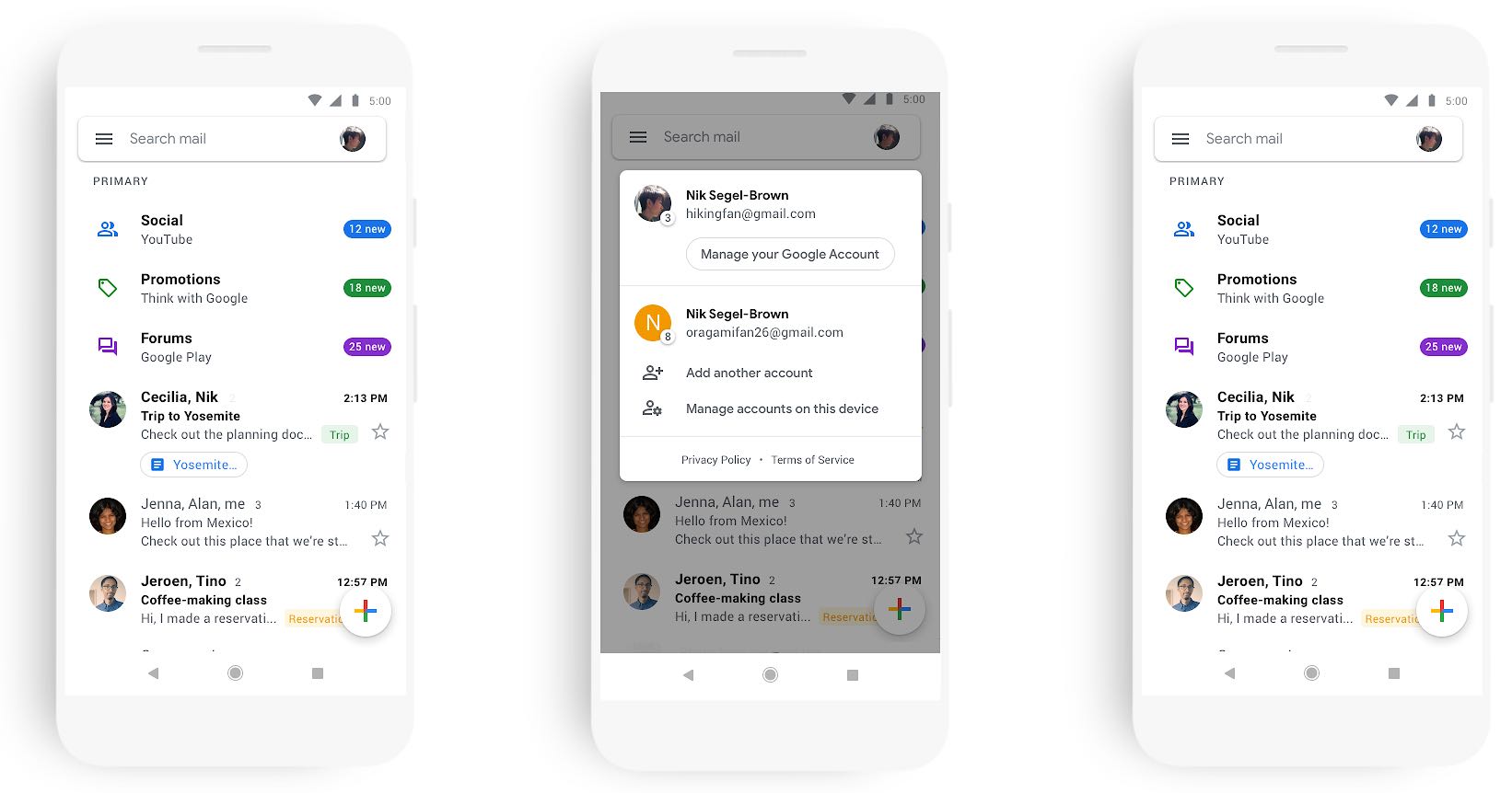
The new version also brings some of the new features seen in Gmail’s web interface over the course of the past year or so, including simplified navigation, prominent search, quick account switching, inline media in the conversations lists for quick access and more.
According to the company:
With machine learning, Gmail can help you draft emails faster using Smart Compose, or reply to messages quicker with suggested responses generated by Smart Reply.
It can also ‘nudge’ you to follow up on emails with subtle reminders in your inbox, as well as notify you to reply to threads so that you can prioritize what’s important or overdue.
“We’ve already updated the web experiences for Gmail, Drive, Calendar, and most recently Google Docs and Sites,” the company noted in a blog post.
The new mobile design in Gmail for iOS and Android is being rolled out on a staggered basis over the course of the coming weeks so check back later if you don’t see it yet.
Gmail is available at no charge in App Store.
Image top of post: labels with attachments (left), account switching (middle) and security warning about potential phishing content (right)