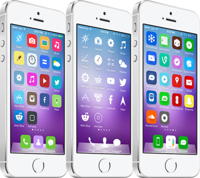
Welcome to the second edition of our Theme Thursday roundup, which highlights some of the best theme releases each week. While this column is primarily focused on iPhone and iPod touch themes, many of them are also compatible with the iPad. We also often mention some worthwhile alternatives to consider looking into. The themes featured this week are: Anode, Clarity, Colorize7, i7Cons and UltraFlat for iOS 7. Take a look…
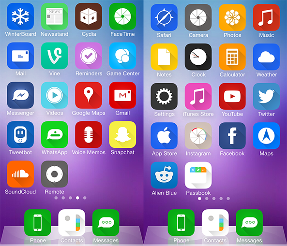
Clarity
If you’re in search of a purely simplistic theme, look no further than Clarity for iPhone. The theme features almost 150 glyphs for numerous stock and third-party apps, which I think makes the Home screen look great. One major caveat is that all non-themed icons will appear square, as this is how Apple has setup icon masks on iOS 7. I would recommend using the regular dock if you choose to use this theme, as ClassicDock isn’t a great match in this instance. Clarity, by Smuys, is free on Cydia in the ModMyi repository.
Anode
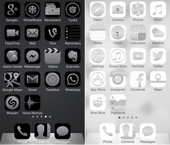
With icons designed to match the colors of the all-new iPhone 5s, Anode is one of the first themes to combine software with hardware. If your device is space grey, silver or gold, there are three versions of Anode in Winterboard to match. While this theme has a fairly large icon set, non-themed icons look like glaring eyesores on the space grey version. Anode, the work of DownyLover, is free on Cydia in the iFans repository. Add repo.ifans.com to your sources. iPhone and iPad versions available.
Colorize7
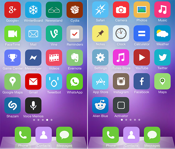
For those that liked the flat design of the StayClassy theme I reviewed last week, but found the color scheme to be too dull, I present you with Colorize7. The theme is very similar in appearance, with each custom icon consisting of a flat color base and white glyph. The main difference is that Colorize7 is much more colorful and bright, which looks better with most blurred wallpapers.
The only icons I am not a fan of are the black ones for Voice Memos and Compass, as they contrast poorly with the rest of the theme. Non-themed icons don’t look the greatest either. An additional 30 icons were just added in a recent update, with more coming. Colorize7, designed by BestCydiaTweaks, is 99 cents on the default MacCiti repository. Similar themes available are Liminal for iOS 7, Sleek7 and Passtel for iPad.
i7Cons
Steven Portas approached me with a request to feature his theme i7Cons here at iDownloadBlog, and deservedly so. The custom icon set is both colorful and flat with shadowed glyphs, and the color palette is a lot less eye-popping than Apple’s version. I like the consistency of the icons in this theme, and the App Store and Settings look much better in particular. i7Cons can be yours for free on Cydia from BigBoss. Looking for something similar? Try Solstice from our 10 best Winterboard themes roundup.
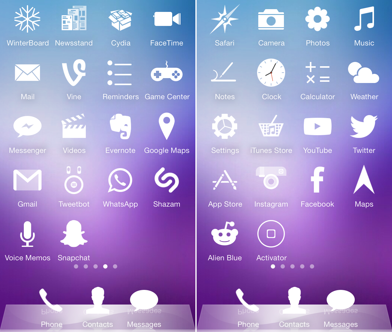
UltraFlat for iOS 7
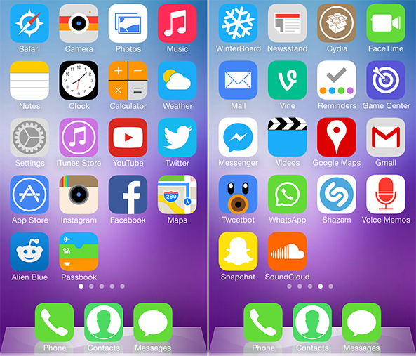
While most themes give your Home screen a complete makeover, the idea behind UltraFlat for iOS 7 is to refine the flat appearance of the stock icons. Graphic designer Ciaran O’Brien has carefully crafted each icon to align with the iOS 7 grid system, and the colors selected are exclusively from the system color scheme. The end result is a theme with a very consistent design that compliments the rest of the iOS user interface. Plus, non-themed icons blend right in. Free on Cydia for iPhone and iPad in the ModMyi repo.
That wraps up this week’s edition of Theme Thursday. As each roundup typically features five themes, there will inevitably be some ones that don’t get covered each week. But we’re all ears to your theme recommendations, and will certainly look to include ones that look good in a future roundup. You can make your recommendations in the comments, and I encourage all theme designers to get in touch with me on Twitter (@rsgnl) too.
Which themes do you recommend for next week?