When Apple’s former iOS honcho Scott Forstall was dumped, stories were told of he and design guru Jonathan Ive nearly coming to blows over the prevailing use of realistic shapes and textures within the mobile software. Now comes a claim the design change of the upcoming iOS 7 will be “black, white, and flat all over.”
Ive, Apple’s Senior Vice President of Industrial Design and newly-minted head of Human Interface across the company, has essentially proposed a radical break with the iOS former Apple co-founder Steve Jobs unveiled in 2007, introducing a look and feel he believes will stand the test of time…
“Ive stated that software designs filled with physical metaphors do not stand the test of time,” reports well-informed writer Mark Gurman for 9to5Mac, citing an unnamed person “familiar with the design meetings.”
This is bound to make lots of people happy:
Additionally, Apple is testing a dedicated, easily-accessible panel for WiFi, Airplane Mode, and Bluetooth toggles.
Ive argued many of the popular iOS applications include differing designs, which could cause confusion among users. The designer’s minimalistic viewpoint could be visible “on every corner of the operating system” while retaining what has made iOS popular, according to the report.
While overall, Ive’s proposed design relies heavily on a black and white interface, particular iOS applications were singled-out for a makeover.
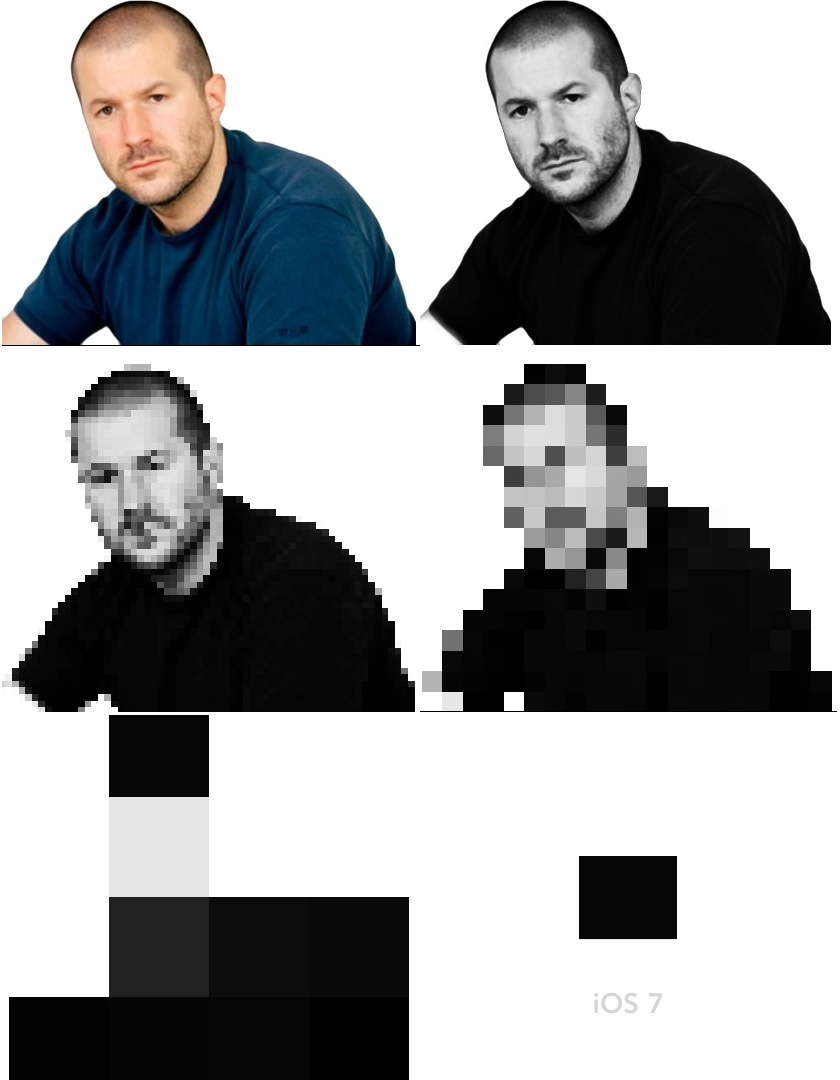
Image via Michael Steeber.
Replacing the textured linen backgrounds for such apps as Apple’s Notification Center and the iPad Calendar may be white text on a black or grey backdrop, for instance. The iOS 7 Lock Screen’s time bar could eliminate the shiny and transparent design for one that’s flat and black, according to the report.
The iPhone’s Notes app has replaced the yellow notepad design for a flat white look. Apps such as Mail, Calendar, and Maps have also gained a more uniformed look with flat white textures.
While the core elements of those apps are mostly white, each app has been given a unique button color. Essentially, each app has a white base with a respective color theme.
For example, the Calendar app could potentially have red buttons, while Messages could have green controls.
Ive’s love of the current flat design meme is also visible on his proposed makeover of the iOS home screen. Gone are the shiny, shadowy and glossy elements. App icons are also redesigned.
The iPhone Notes app loses the yellow background, replaced by a flat white appearance. Also, such iOS apps as Mail, Calendar and Maps share the same design features, each application’s buttons given a different hint of color.
I need an Apple streaming music service so my iWatch can tell me what song is playing on my Apple television. But not skeumorphically.
— Peter Cohen (@flargh) May 24, 2013
Of course, the iOS 7 unveiled alongside OS X 10.9 during Apple’s June WWDC show, could feature a different design than the one being pushed by Ive.
But as the soul of Apple design – and with the ear of CEO Tim Cook – Ive’s proposal should receive serious consideration.
Can you imagine a mostly black and white, flattened iOS?