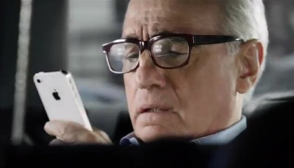
If you’re subscribed to Apple’s official YouTube channel and have email notifications for new uploads enabled, an alert may have hit your inbox today saying Apple just uploaded the Siri ad starring film director Martin Scorsese (go here for a parody treatment).
And just like that, because the video has replaced the original clip, a bunch of web pages that have the original embed code in place now show empty boxes (don’t worry, I already updated our article with a new code).
At first glance, the commercial is exactly the same as the original ad from two weeks ago. At closer inspection, the new version removes the AT&T branding and fixes a minuscule editing error that only the pickiest of eyes would catch. That’s attention to detail for you…
One of the theories I read somewhere today goes something like this: Apple just stopped airing three new Genius ads because – the story goes – bloggers have met them with ridicule (even if it’s been Apple’s plan all along to feature these commercials only for a “first run” during the Olympics, meaning just the first weekend of the Games).
Then, the company decides to reupload the Martin Scorsese taxi driver Siri ad so that the “embarrassing” Genius ads are no longer featured on its YouTube channel.
That’s totally baseless speculation. Apple can feature whatever video they want on their channel, unless folks manually hit the Videos tab and then sort entries from the newest to the oldest.
Enter Cult of Mac‘s Michael Steeber who gets the kudos for spotting the difference between the new and “old” Martin Scorsese ad.
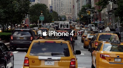
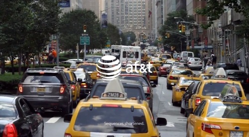
This is what the ending sequence of the original ad looked like. The Apple logo gets followed by the AT&T branding and “sequences shortened”.
In the new version, the Apple branding and “sequences shortened” have been combined and the AT&T branding has been dropped.
That’s nice, but nothing quite shows Apple’s famous attention to detail like the following example.
This is a frame from the new version.
And the same frame taken from the old version of the commercial.
The difference, according to Steeber:
As you can see, someone went in and fixed a minuscule editing error that only the pickiest of eyes would catch. In the original ad, you can see that the ‘3’ in 8:43 seems to be pasted over the real time, in order to line up the time progression in the commercial, as at one point late in the ad, Marty’s iPhone switches to 8:44. In the revised ad, the editing error is gone, and the time looks normal.
If you still can’t distinguish between the two variants, the source article over at Cult of Mac makes use of an animated GIF to highlight the edits.
And here’s the original advert, courtesy of a YouTube user who still has the clip in his account (Google will probably take it down).
[tube]Ncv7VLkAAvA[/tube]
And this is the re-worked variant.
[tube]LEolXYC09sw[/tube]
It’s typical Apple.
They air an ad and then bother making minuscule edits two weeks later that no sane person will ever notice.
It’s an established fact that Apple agonizes over every detail in their products, packaging, marketing and just about every other area of its business, regardless of whether it’s facing consumers or its employees.
Our own Sebastien Page was equally impress after discovering that the Music app in iOS 6 features the volume knobs that mimic a light reflection effect when you tilt your device.
Oh, and Apple, while we’re at it: how about using the real poison oak tree image in that Siri ad you plastered over the back cover of the Economist?
Don’t you just love how everything about Apple has to be meaningful and thought all the way through?
By the way, as pointed out on Reddit, the cab number of that taxi is the same as Travis Bickle’s in the Hollywood classic Taxi Driver, directed by – you guessed right – Scoresese.


