Much has been said about Apple's management shakeup that happened last October. If Scott Forstall's departure came out as a bombshell, the fact that Jony Ive, Senior Vice President of Industrial Design, was made the head of the newly created Human Interface group was less of surprise.
Now in charge of everything design, Ive has been expected to give iOS a facelift by getting rid of, or at least by minimizing all use of skeuomorphism in Apple's mobile operating system. But it doesn't stop here!
Something we've been hearing for a while when talking about Ive's possible take on an iOS makeover is the word "flat". Not flat as in boring. Flat as in simpler. This was confirmed last week when 9to5Mac reported that according to their sources, iOS 7 might be black, white, and flat all over.
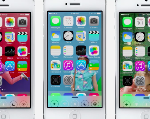
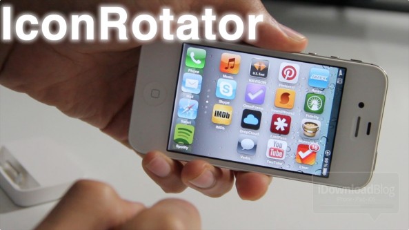
What does that mean for parts of the UI such as app icons? Our friend Sonny Dickson got his hands on a blurry screenshot showing the Home screen of an iPhone running iOS 7. The image quality is terrible, but with the help of talented designer Surenix, we were able to reproduce some of these icons to give you an exclusive look at what some stock app icons on iOS 7 might look like.
If we had to describe the changes in one word, that would be: unified...