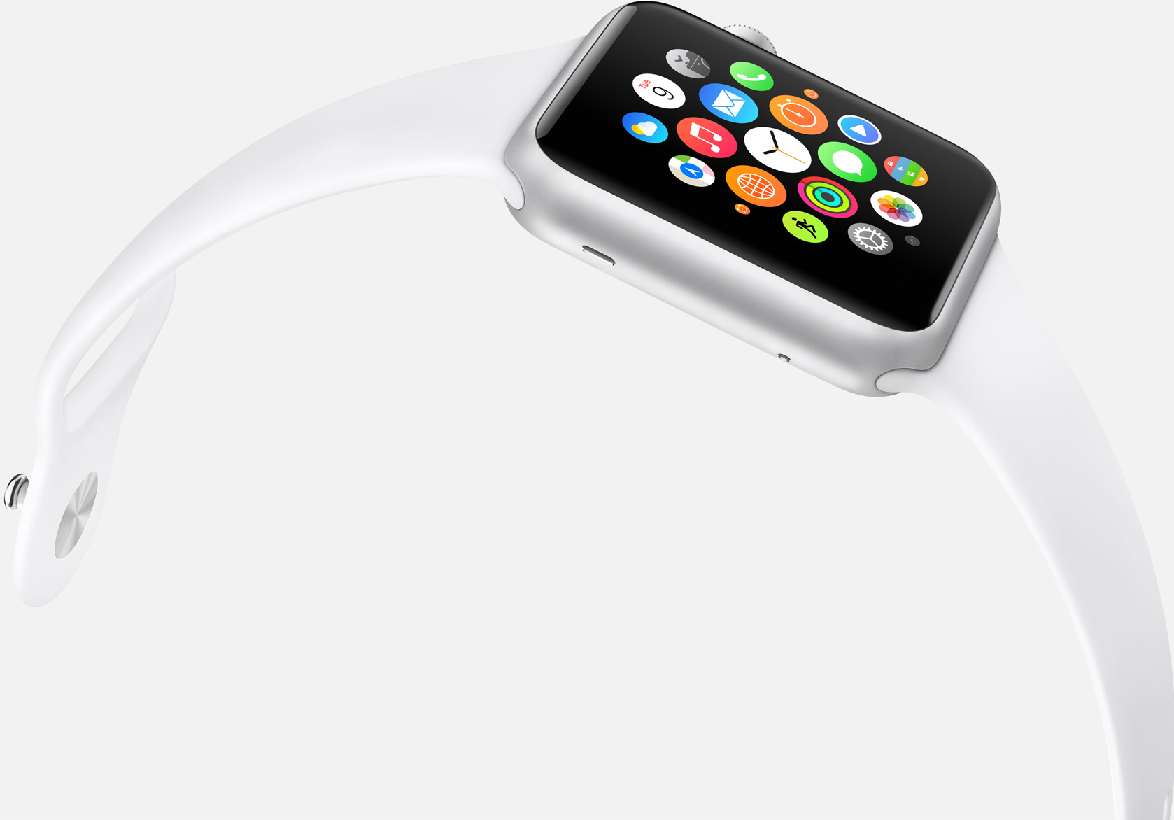
Much was made of Apple’s third major software overhaul for watchOS this year with Control Center and the Dock seeing the light of day, finally making for a much beefier experience on our wrists. The one other central interface of Apple Watch received no love though, meaning users are still embroiled in a love-hate relationship with their watch’s Home screen. It is easy to let patience wear thin with respect to Apple not pushing the Home screen on Watch forward, then again it took Apple more than a couple of years to refine the iPhone’s Home screen, just to put matters into perspective.
Regardless of the pace at which Apple is planning to shape up the screen accessed by pressing the crown, design and functionality changes are eventually going to take place. It’s a highly emotive topic and any watch owner will be able to raise one or two aspects they either dislike about the Home screen or wished to be fundamentally different. Personally, with the arrival of my snappier Series 2 watch, the Home screen is about the only qualm I still have with Apple’s youngest product line. So there, let me add my voice to what the Home screen in watchOS 4 needs to implement in order to catch up with the rest of the operating system.
Folders
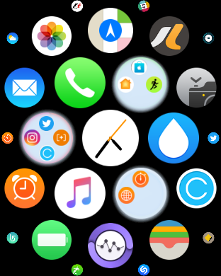
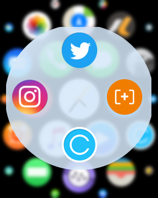
The first thing that springs to mind is an easily replicable folder system for the circular icons on watchOS. It was no earlier than with iOS4 that app folders finally found their way to the iPhone’s Home screen, so watchOS 4 could and hopefully will introduce a concept resembling the mock-up above and below. While some might argue a whole bunch of smaller bubbles inside the incumbent bubbles sounds painfully finicky and confusing, I would argue that more than anywhere else, folders are duly needed on the watch. I mean, may I remind you of the proliferation of the four orange time piece icons? I’m seriously itching to stuff them into a wondrous, round folder.
Customizable icon sizes
Accessibility features on Watch touch on this request, but unfortunately do not take it all the way yet. By way of activating the Reduce Motion setting on your watch, you get to tinker with the icon sizes to a degree. Flicking the switch renders all icons in uniform size as opposed to them shrinking on the peripherals of your Home screen. However for my money, what would both greatly improve navigation and curtail the rate of mishits (when you’re desperate to start a workout but keep hitting the weather icon) is a cluster of individually scaleable icon sizes. That is to say, why not offer users the chance to inflate icons that are being used more often than others? It is not as though Apple does not have their own UI to draw inspiration from, as they could easily lean on the Apple Music interface ‘Choose Artists For You’:
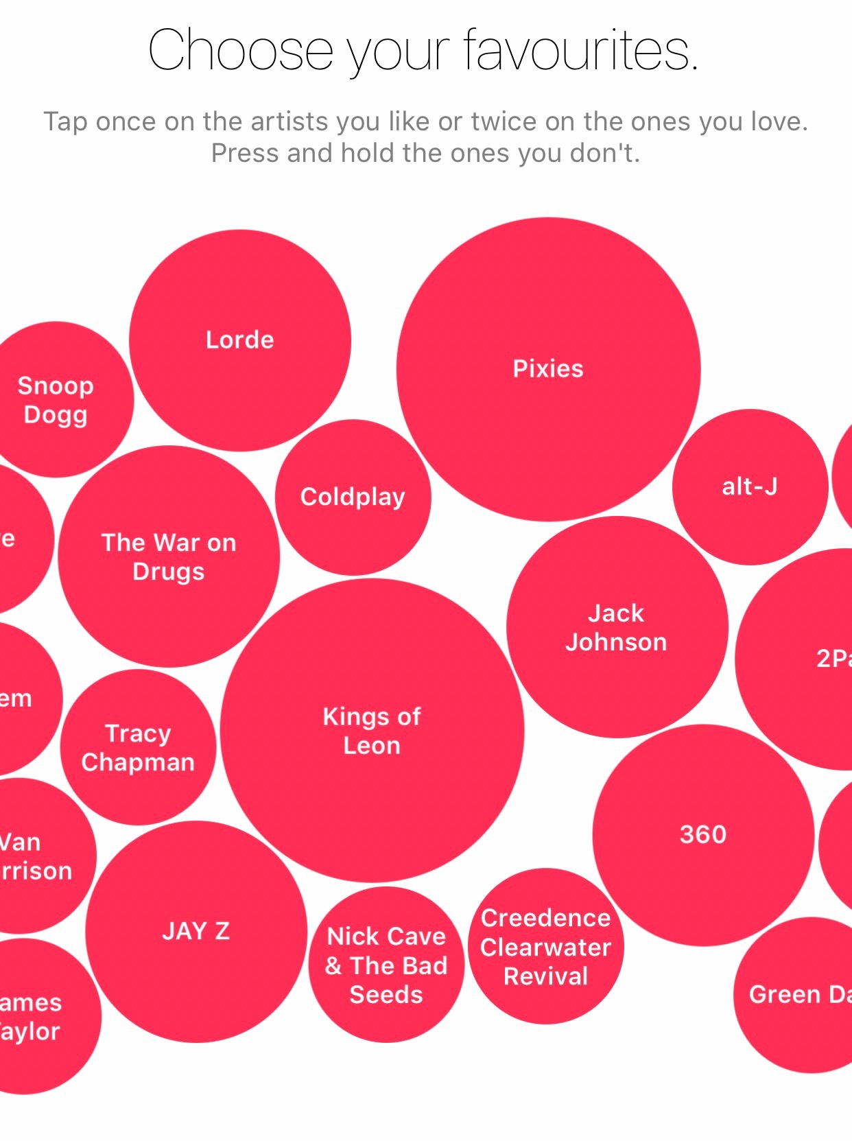
I would be delighted to see a setting in which I can tap my icons once, twice or three times to determine their size. Or how about intelligent machine learning, in which the icons swell the more often we use them? In light of what Windows has done with customizable tiles before, I would not hold my breath for this to happen, but I am certainly rooting for it all the same.
Add missing apps
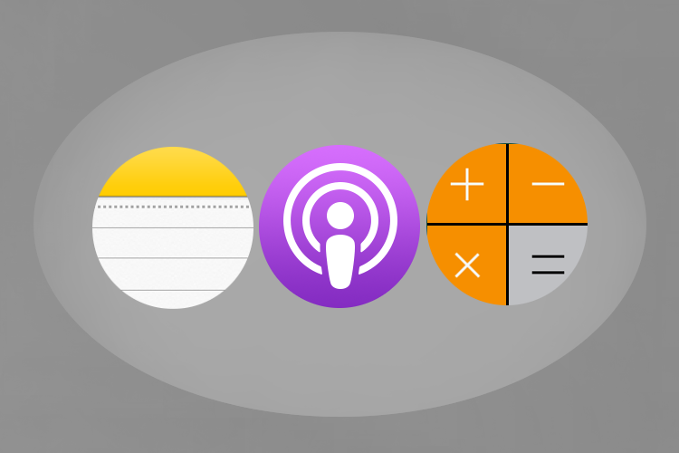
This one is a no-brainer, since Apple has still not managed to complete the app line-up on Watch. Being a staunch Podcast listener, I am still yearning for a purple, circular icon on my watch’s Home screen. What about Apple News? Notes? iBooks? Utility apps such as Calculator? The list goes on, and whilst I understand that the Home screen will always be bereft of the iPhone’s richness, surely we can all stomach a few more icons thrown in the mix. Especially when or if app folders are being added.
Cleansing the Home screen
As important as ridding the Home screen of waste of space icons is, it goes hand in hand with the features requested above and there is little point in introducing it prior to them. As soon as Apple entrusts us with a bigger pile of icons however, they should also permit the deactivation and activation of any app icon through Settings. This is not only a function of customisation but more vitally personalisation and something iOS 10 has at long last executed. By the same token, watchOS should follow suit.
In regard to implementation, it would be as easy as bringing the ‘Show on Apple Watch’ switch already in place for third party apps over to the stock app array:
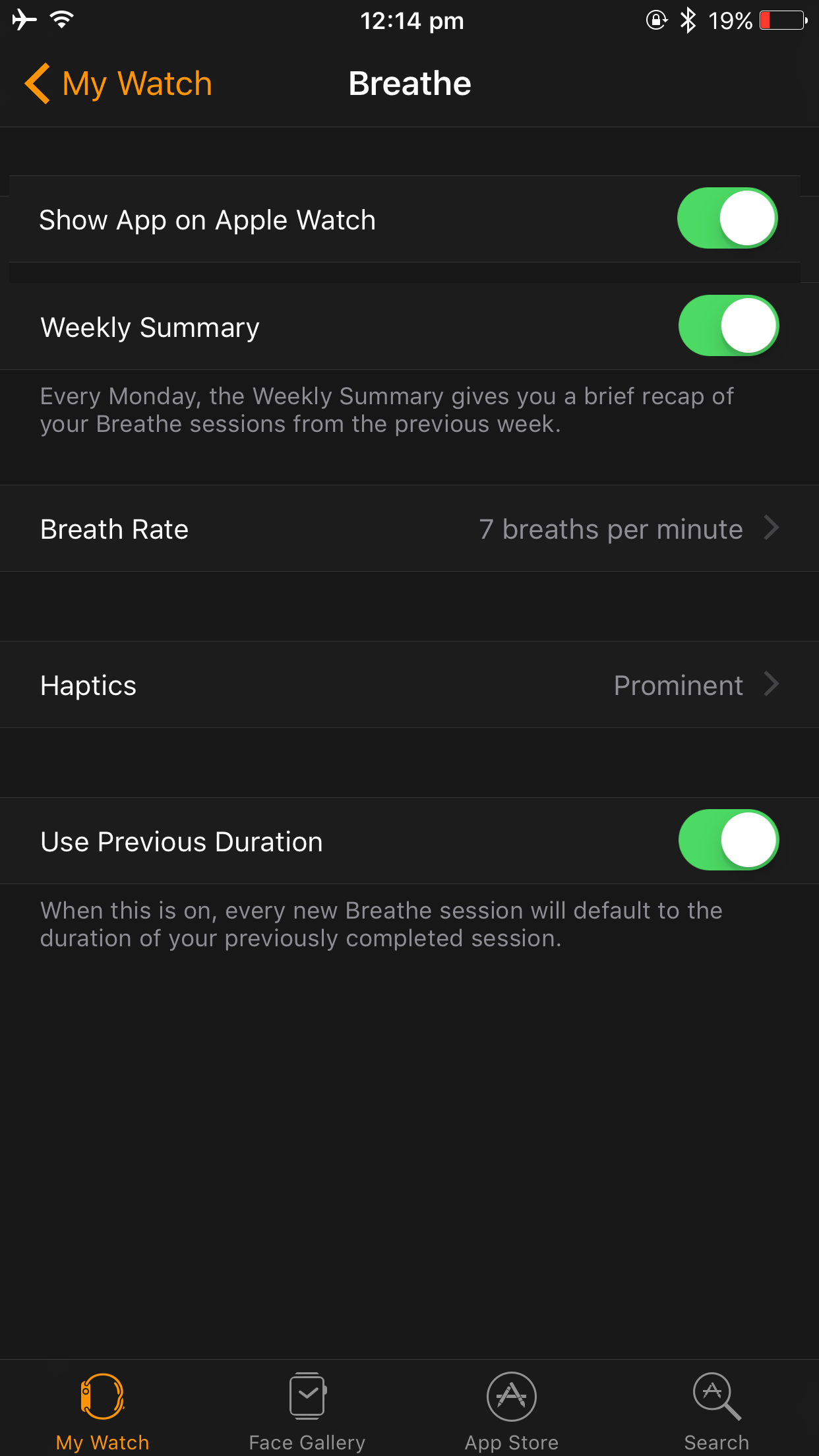
Down the line this appears to be a safe bet for release – as it promises to bring much needed order into the mess the Home screen can be. Plus as excited as I was about Breathe at first, by now it would probably fall victim to my first icon purge.
Zoom & scroll speed
Lastly, rotating the the digital crown counterclockwise to zoom out of the icon cluster always felt less than half-baked to me. The idea is rock solid and an intuitive gesture to take a step back from the overwhelming flurry of icons is much needed, but the zoom in/out feature still feels iffy at best. What is it with Apple limiting it to one immovable degree as soon as you let go of the crown? When I dial back the crown just a touch to unveil the icons out of immediate sight, why does my watch have to zoom back into standard view as soon as my finger leaves the crown? Conversely, if I want to look at the bigger picture and zoom out to the max, just let me do it, Apple. The software that decides to jump back to the one accepted level of zoom instead needs to be supplanted with the next major watchOS upgrade.

Aside from the zoom, the speed of manoeuvring the cluster ought to be adjustable in the shape of another Accessibility feature. I for one am content with the speed at which I can blast from left to right or top to bottom, still I know of people that would wish for a slightly more conservative experience. One simple setting to for example halve scrolling speed would therefore be of use to a whole slew of customers.
It goes without saying that this is the revisionist approach, contrary to demanding a complete reset for the Home screen on Apple Watch – which too is a valid stance to take. I understand why the cluster format was chosen and by and large believe it has panned out okay. It is now upon Apple to deliver the tweaks necessary to take the platform to the next level.
Have anything to add to my wish list for next year’s upgrade? Sound off in the comments!