Google today updated its mobile mapping application for the iPhone, iPad and iPod touch with some rather useful visual tweaks. Google Maps 4.21 for iOS now highlights local areas that might interest you, adding multiple destinations to a route is supported in the new version and the typography of street names, points of interest, transit stations and other places has been improved to make them easier to read on smaller screens, among other changes.
Cleaner look
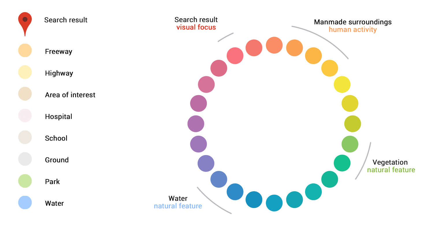
As mentioned, the latest version of Google Maps for iOS brings out a subtle color scheme to make it easier to differentiate between man-made or natural features as you browse the map, and quickly identify places like hospitals, schools or highways.
Here’s what each color on the map represents.
Crisper typography
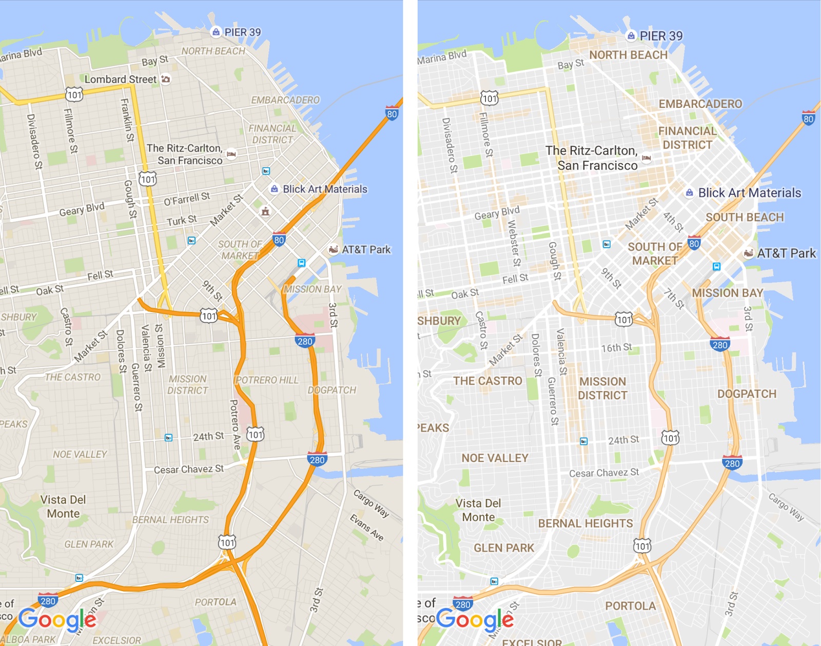
In addition to tweaked colors, the application includes other visual changes to make it easier to read the names of streets and other places of interest on smartphone screens, such as improved typography and the removal of road outlines and other non-crucial elements (see the before vs. after comparison top of post).
Areas of interest
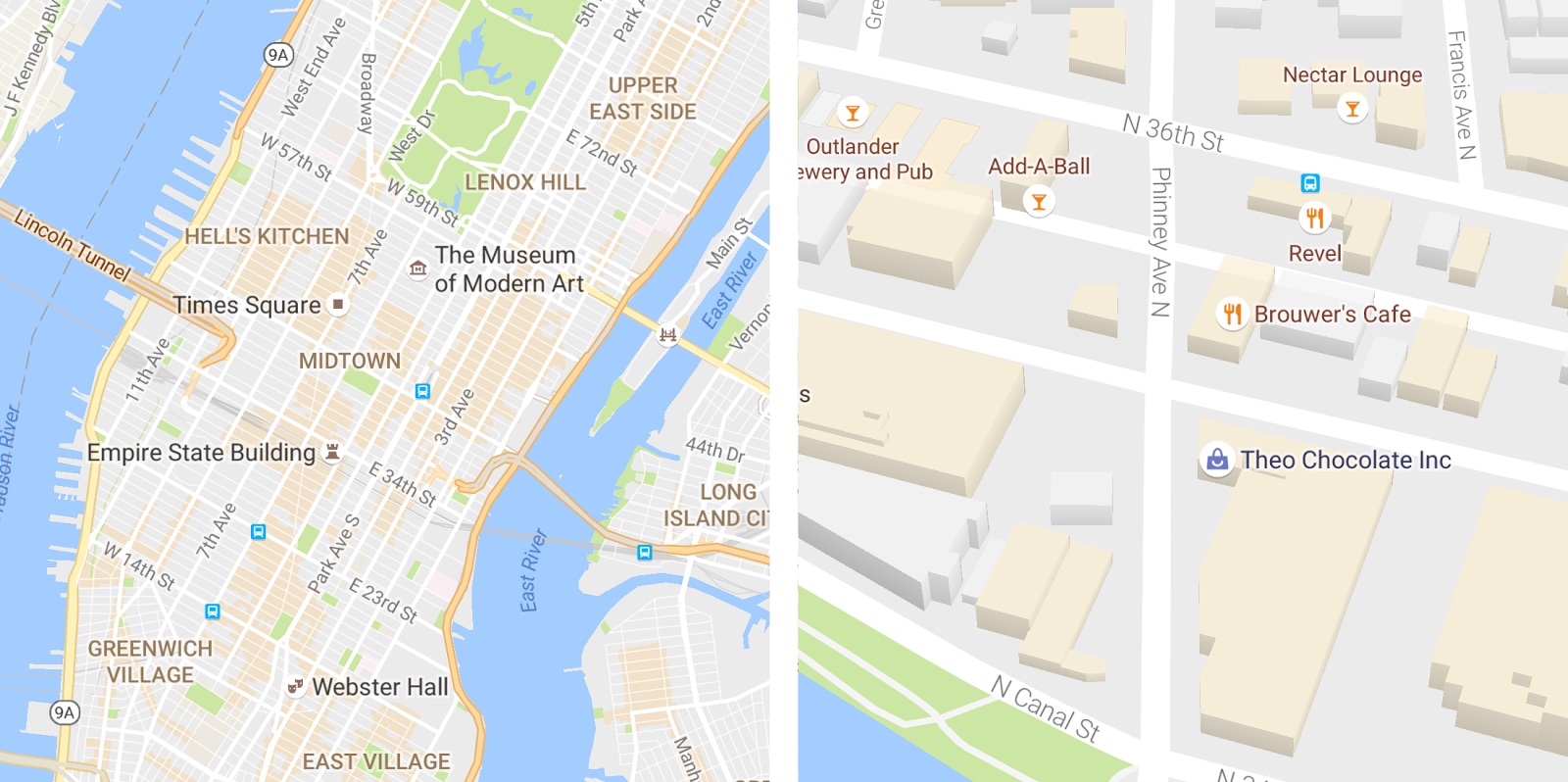
As you explore the new Google Maps look, you’ll notice areas shaded in orange. These are your “areas of interest”, which Google defines as places where “there’s a lot of activities and things to do.” The video below shows this in action.
To find an area of interest, just open the refreshed Google Maps app and look around you. When you’ve found an orange-shaded area, zoom in to see more details about each venue, and then tap one for more info.
More legible maps for everyone
Google says it determines areas of interest for your location with an algorithmic process that allows them to highlight the areas with the highest concentration of restaurants, bars and shops.
Plus, in high-density areas like New York City, Google augments the algorithmic process with human curators. All of the above improvements are now available in the mobile Google Maps app for iOS, Android and on the web.