Some pundits continue to call for the merging of OS X and iOS into a monolithic operating system that would simplify app development and allow Apple to engineer consistent user experiences across its desktop and mobile platforms.
I’m not so sure the time is right for an iOS-ified OS X.
That, however, hasn’t stopped designer Andrew Ambrosino from envisioning what the future of OS X might look like. Introducing Andrew’s OS X 11 concept, which brings Apple’s desktop operating system in line with the flattened appearance of iOS 7…
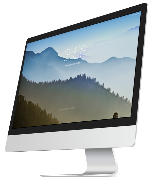
Such an experience would start with a redesigned login screen reminiscent of the iOS 7 Lock screen, as depicted top of post.
For what it’s worth, I’m not entirely sure how logging in to my Mac by swiping would improve my experience. On the other hand, OS X for instance could detect my iOS device over Bluetooth to unlock my Mac directly from an iPhone or iPad device.
Better yet, just unlock my Mac when you detect my iPhone and realized I’m sitting in front of my computer.
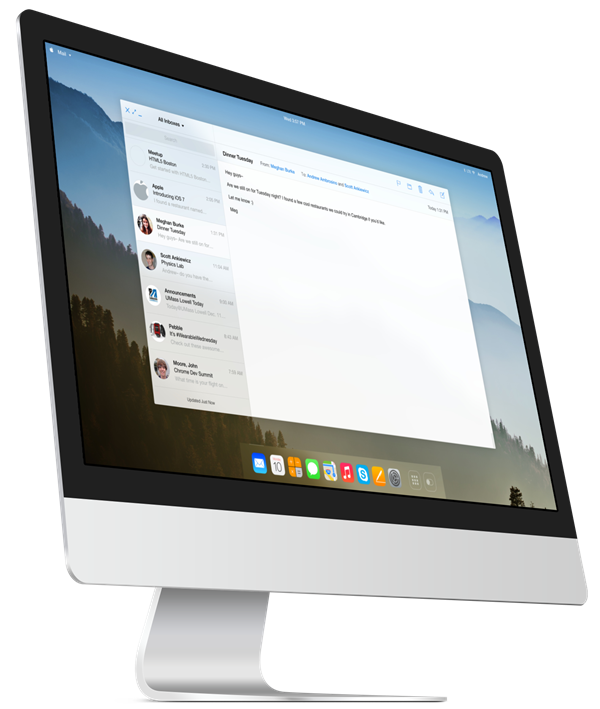
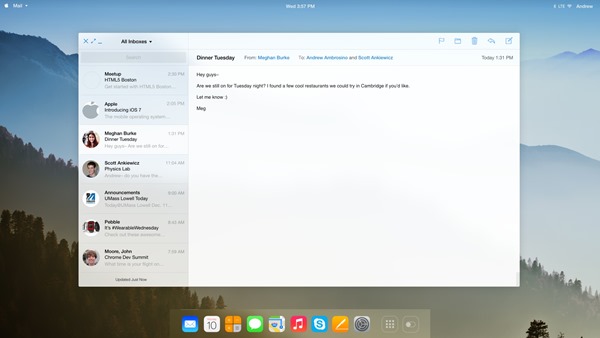
I do dig the flattened Mail application, seen below.
From Ambrosino’s blog:
A concept version of OS X inspired by iOS 7. Includes some good flatness, translucent blurs, and overall streamlining.
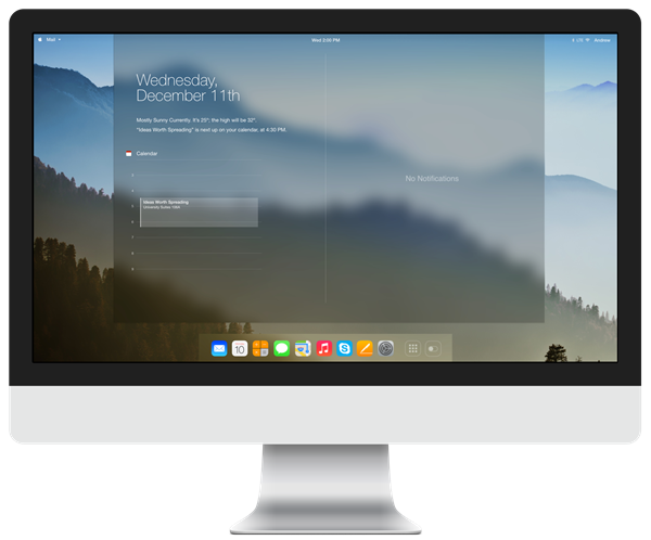
I’m even more ecstatic about the translucent notification panel.
The current OS X Notification Center implementation is ripe for change, in my personal opinion. As you know, the Notification Center is invoked by swiping with your fingers from the right edge of your Mac notebook’s glass trackpad to the left, or using a customizable keystroke.
The panel slides into view from the right and pushes your entire screen to the left. This has always annoyed me as I don’t appreciate my eyes refocusing and tracking the scrolling of my desktop canvas, just to see some alerts. A translucent bar falling from the top of the screen, like in iOS 7, would work much better if you ask me.
Again, right below is a flattened Mail app.
For an insight into how the Messages app would look like flattened, check out Ramotion’s awesome renderings. By the way, I’m loving the new status/menu bar with the current time in the middle, your menu bar items on the right and menus on the left.
I think the menu bar as Andrew’s concept envisions it looks much better transparent than semi-translucent, like in Mavericks (you can turn off the translucent menu bar under the Desktop & Screen Saver pane in System Preferences).
OS X Mountain Lion and Mavericks have already brought a myriad of iOS features to the Mac, such as the native Maps and iBooks apps, Notification Center, Notes, Reminders, iCloud sync and more.
Andrew is the brains behind another concept we’ve covered, the iOS 7-ified Apple TV UI.
What Apple should do for its next major OS X revision do you think?
Should they flatten the user interface, make it translucent and layered and bring even more features from iOS to the Mac? Or continue developing the two pieces of software separately of one another?
Knowing Apple’s penchant for uniformity and given Ive’s now in charge of all design (software and hardware) across the company, Andrew could be on to something here.
Besides, uniformity and consistency could go a long way toward lowering the psychological barrier of entry for people who are new to the Apple platform. iPhone users considering a Mac purchase would be more likely to adopt Apple’s computers if they could rely on their iOS muscle memory to operate the Mac, and vice versa.
I guess we’ll find out soon enough – Apple has pledged to accelerate pace of OS X development by releasing a major OS X iteration every twelve months. If history is an indication, we should get a glimpse into OS X 11 at next summer’s WWDC.
Don’t be shy – sound off in the comments.