This is kind of interesting. New versions of some of the stock app icons in iOS 7 have been spotted on Apple’s website. The reason for the changes is not yet known, but the app icons have received the blunt of the criticism thus far regarding Apple’s new mobile OS.
Some of the new icons are starkly different than the ones seen in the first developer beta of iOS 7, while others appear to only feature subtle differences. And it’s not clear if this was a mistake on Apple’s part, or these will be the new app icons in iOS going forward…
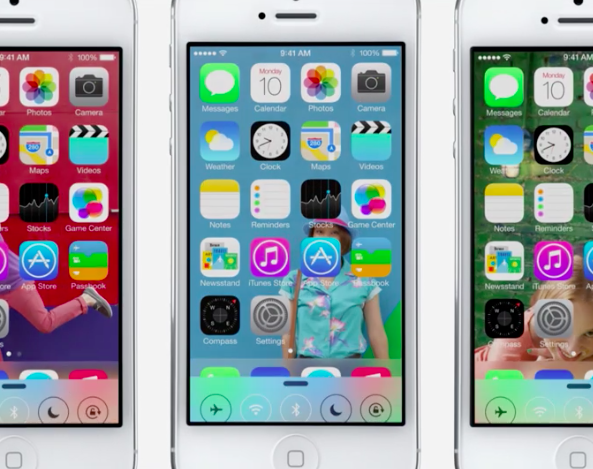
9to5Mac’s Michael Steeber spotted the new icons, pointing out that they can only be seen on Apple’s website from a mobile device (for what it’s worth I can see them on my desktop). The image containing the icons can spotted in the design section of its iOS/iOS 7 page.
![]()
The Weather app icon has changed the most out of the bunch, with a text readout of Apple’s infamous 73 degree weather replacing the sun and cloud graphic you see in the current beta. And the icons for both Passbook and Reminders received more subtle color changes.
Again, it’s not known if these are past or future icon designs. But at the very least it’s an indication that Apple isn’t opposed to tweaking the designs, which again have been very controversial this week, as it looks to tighten up its redesigned OS over the next few months.
Apple introduced iOS 7, which is very different than its predecessors, on Monday this week during its WWDC keynote. While many have lambasted the company for the new design, rumor has it that it plans to make many changes before its public release in the fall.
What do you think of the alternate icons? Better or worse?