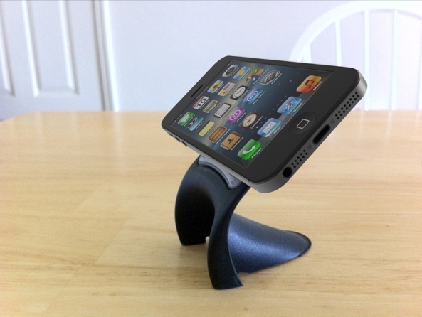
You’ve by now seen gorgeous iPhone 5 renders based on a bunch of parts (that continue to leak out of Asia like there’s no tomorrow), like a miniaturized Nano SIM tray and a slightly smaller home button.
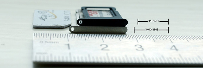
Repair firm SmartPhone Medic took it all together and created a video that aims to compare the new Nano SIM tray to the Micro SIM standard found on the iPhone 4/4S.
It also puts other purported parts in direct comparison to their iPhone 4S counterparts, namely the volume buttons, the mute switch and the sleep/wake button…
Kudos to MacRumors for spotting this video on Cydia Blog.
As you can see, a regular Micro SIM card from the iPhone 4/4S does not fit the smaller tray thought to make an appearance on the next iPhone.
[tube]8kPMmGlg6Wo[/tube]
As you know, the European Telecommunications Standards Institute on June 1 accepted Apple’s Nano SIM proposal as the de facto industry standard. Apple’s implementation is forty percent smaller compared to Micro SIM, allowing for thinner devices.
A handy comparison between a Micro SIM and a Nano SIM tray, via NowhereElse.
As European carriers have reportedly been stocking up and testing Nano SIM cards in partnership with Apple, conventional wisdom has it that the iPhone 5 will mainstream the emerging SIM card standard.
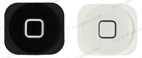
As for the home button, it looks very much like one leaked by a Chinese parts vendor back in April and seen right below.
According to precise measurements by ETrade Supply, the hole for the home button is 0.3mm smaller in diameter than that on the iPhone 4S. Also noteworthy, the area around the home button of the iPhone 5 glass lens narrows down, indicating a smaller loud speaker on the next iPhone.
It would seem that at this point the blogosphere has pretty much nailed the iPhone 5, at least its outer appearance.
So much about Tim Cook promising major doubling down on secrecy.
I kinda like the grey look of the sleep/wake button (a little bit more narrow and not as tall), the volume buttons (pretty close in size) and the mute switch (slimmer).
If anything, the buttons fit the overall two-tone appearance of the product (not everyone likes that design). Besides, the gunmetal gray look is a notable departure from the silver buttons on the iPhone 4S.
Did you notice anything else in the clip?


